.
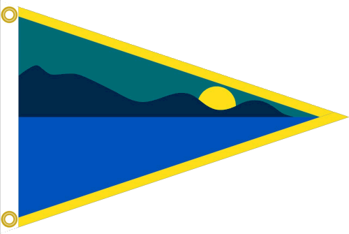
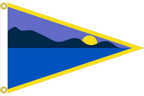
Have just had the artwork emailed for approval. I sanctioned one small change - yellow border is now only top and bottom, otherwise would look too 'stripy' with white webbing on the vertical plus a yellow stripe.
.
It is more turquoise - its to do with the palette available I gather, but I have enquired. I thiknk it is fine with the turquoise, just means you will have to change your avatar.
I think may fade into "sameness" once the sun (are we due some next year?) get's to them . Go for maximum contrast.
If mine goes peely-wally I want a refund.
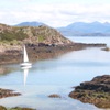
http://trooncruisingclub.org/ 20' - 30' Berths available, Clyde.
Cruising, racing, maintenance facilities. Go take a look, you know you want to.
I know this is a bit like throwing a spanner in the works but...................
I don't think either of the latest options are particularly satisfactory.
Would it be possible to seek another manufacturer who had a more comprehensive palette.
I thought the version you posted on the 25th November was excellent. I think those colours reflected the area many of us sail in. I'm not sure that the current options do this.
Tend to agree with Ocklepoint - not in a particular hurry as boat won't be in the water until April- However realise this could meant more hassle for webcraft - in which case I would go with the mid- blue.