Anyone sitting around at a loose end with an underemployed fine tooth comb is cordially invited to look for errors, mistakes and inaccuracies. I will be very disappointed if Claymore fails to find anything.
Nick wrote:.
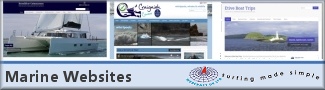
Thanks for all your encouragement. The site is now complete and live at http://www.webcraft.co.uk
Anyone sitting around at a loose end with an underemployed fine tooth comb is cordially invited to look for errors, mistakes and inaccuracies. I will be very disappointed if Claymore fails to find anything.
OK - First para
"Webcraft UK provide affordable, effective web design and internet solutions for small businesses from every sector of industry. We are one of the oldest web design companies in Scotland, incorporated in June 1996. We have created hundreds of sites for clients all over Britain and futher afield. There is no substitute for experience"
Ash
"This is a sailing Forum"
Albin Vega "Mistral" is now sold
.
Had a look through ALL the page s in FF this morning and realised that there was a problem with text overlapping the floating images on several of the pages. I've fixed it now, but am surprised none of you pointed it out - I thought quite a few of you used Firefox as your default browser.
The site still looks rubbish in Opera, but that is Opera's fault, not mine. Opera does not handle floats well. I could create an Opera-only site with tables and no newsbox, but I am not going to.
Google Chrome also throws up some clumsy looking pages, but it is in Beta and so I don't much care about that either. It screws up a lot of web pages, and until Google sort it only rabid neophiles are going to use it as their browser of choice.
A couple of adverse comments. A scrolling banner such as appears at the bottom of each page is in many web design circles considered bad practice - it is something to do with people who are partially sighted I believe. Second comment is that the text on each page is pleasant and easy to read, but each page has a scroll bar to view the bottom half of the page. The volume of information on each page is such that it could easily be displayed on one screen without a scroll bar, and therefore be easier to read.
In 1995 the web was brand new and we had to sell the concept before we could sell our services. The lack of product knowledge in our target market meant we were frequently competing against opportunists with a good sales pitch but no technical knowledge or background.Over time we developed a reputation as a trustworthy company that got results, with most of our new business coming through word of mouth. Clients found that they could talk to us, and that we could explain complex technical issues in a way they could understand and relate to their business.
--------------------- Artificial Intelligence is no match for Natural Stupidity
.
Thanks Pete. I am aware of the considerations you raise (having been in the business for over twelve years) but haven't worried about them for the following reasons:
a) Lots of things are considered bad practice in some web design circles - but as the scrolling banner in the IFrame does not carry mission-critical information and there is another way of acessing the portfolio through static image links I really don't care. I will leave the partially sighted section of the small business sector as a plum to be plucked by another company. The average punter looking for a website likes bright shiny moving things, and who am I to criticise them?
b) To display the same volume of text on each page without a scrollbar you would have to do one of the following:
1) Lose the images / left border
or
2) Reduce the text size (not good for the aforementioned hard of seeing)
or
3) Increase the screen width, which would result in a horizontal scrollbar for the majority of viewers - a much bigger web design no-no.
I am not really all that interested in potential clients who can't be arsed to move their mouse to view the bottom of the page . . . they are likely to be a major PITA in so many ways. My own personal rule of thumb is to avoid where possible creating pages that scroll for more than 2x the average screen depth (most popular browser screen resolution is currently still 1024 x 768)
Um, well, it's quite nice but a bit small-businessy or even sub-small businessy. And um, a bit dull? in no particular order....
1 You bang on about cost effective, so you seem to want to attract the most poverty-stricken types?
2 Scottish flag er what's that about if worldwide service? Yanks learned this ages ago and now far fewer inyerface stars and stripes around on US sites. I would dump it. Could be quite a negative for english, or maybe that is what's intended? I mean, it says to me "don't call unless yer scottish, preferably highlander and/or gaelic speaking!"
3 Bit lump of text on home page is actually NOT that easy to read - it is set like a very nice thread post, not a read-me-in-2 seconds attention grabber ? Your highlighted skills should be on bullet points so i can see them all ?
4 in a selling situation, asking a punter "why not ....?" induces a powerful reverse : "Because I don't know anything about you! - that's bluddy why not, matey!...."
You can achieve a gentler-reading and actually more powerful effect by putting the reader/decision in the (presumptive) past tense eg "with webcraft, you'll know you made the right choice" etc
5 If you want a bunch of tightfisted clients, use a loads of "cost effective" and "simple 1-page" which almost is the same as "we can even reuse your old web pages to save money" or perhaps "sometimes we can just search and replace a few words and bosh i can't see it costing more than twenty five quid!" No good at all.
Btw, nothing but nothing should be "simple" if you are selling technical services, same as if your are selling medical products the word "safe" should be banished from your lexicon. You can say "reasonably straightforward" if the client wants you to do one line of programming, but be firm about "our minimum charge is £200" or whatever.
6 plentiful use of the word "professional" means "it's gonna cost more than a grand, for almost anything". The word "corporate" means its gonna cost well, gosh, loads more than that, but it will be really fab and who cares?
BUT pictures of Scotland means it's going to be a bit damp and cold albeit quite scenic. Doesn't really conjure up image of excellent service or whizzy innovation.
7 "In choosing your next website designer, are you looking free 24-hour support, unlimited pre-sales consultancy, and unbelievably low prices? If so - web design from Webcraft probably isn't for you. We offer
full-service blah
site management
realistic pricing
....Now, i'd read the rest of that page. I confess i haven't read all your page, not really. Bit boring, and i was diverted by the "wonder where that is" of the nice scenery, which is actually irrelevant to what you do.
Note that the "your next website" and or "your next website designer" shows that you are a step UP from whatever they've got now. Sellers of massive boats do this a lot, v powerful.
8 Or do you want to be the sort of ultra-scottish of web design? "None of that techno babble with webcraft - our proven methods distill the very ideas and mature them in oak-lined pubs for several days.... " hm, that might be a bit tough, too much humour as well but couldn't resist.
9. Finally, tough economic conditions should logically mean you put your prices UP, not down. Cos fewer punters see?


 Artificial Intelligence is no match for Natural Stupidity

